My dad sent me a link to a story on the SF BUsiness times site, and after logging in and seeing the story, I found myself wandering. I saw side by side ads for Verizon and AT&T careers, and I was curious about how these ads were related to the destination content. My, was I surprised. The sites both linked to the homepage of the respective career pages. I'll show AT&T and then Verizon's. Both companies are so large, and nationwide employers, it is interesting that they approach things so differently.
With AT&T, I felt welcomed by a gallery of faces of actual humans, and there's enough happening on the site that everyone from recruiters, to college students, to experienced professionals should be able to find what they are looking for. You have to hand it to the company for using the .jobs TLD (the site is http://att.jobs) yet the branding feels spot on for what I expect to see from the other touchpoints I regularly use as a customer.

By contrast, I found Verizon's careers site mystifying, wit so many links to so many things, and so many groupings.
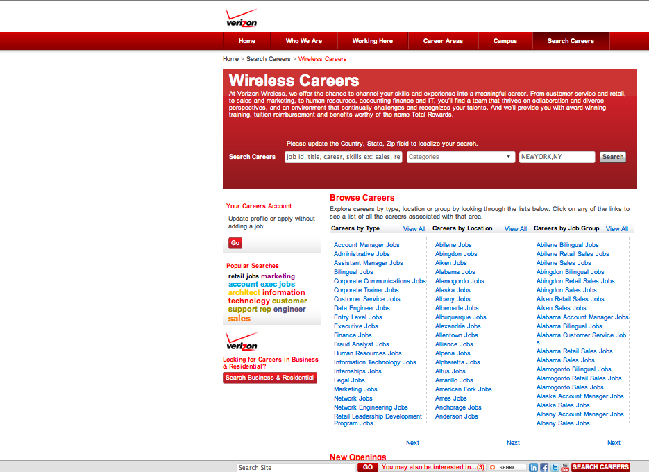
Remember, no matter how much your site's success depends on organic search, and regarless of the desperation of your target audience to "convert" (whether a job application, tshirt purchase, or other action) someone will actually, eventually, with human eyes, look at your site.
I'm seeing more and more the paradox of organic search and the site design below, which seems to put everything but the kitchen sink as a text link on the homepage. This won't last forever, and the increasedinfluence of social content and participation on link relevance will hopefully limit the impact of these usability-killing visual mazes.
UPDATE: In fairness to Verizon, it seems like the page I landed on wasn't the home page. The home page, below, shows off more of the corporate identity that I saw on AT&T's page. I'll stick to the point about the SEO contrast, but I also think the landing page choice for Verizon was not the best. Choosing the right campaign landing page is a question for another day.
